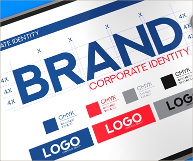
Creating a Brand Identity -- Logo Logic
Establishing brand identity is important, and consistent logo appearance is key. Here’s food for thought in designing or deploying yours. How do you keep your logo, and its contribution to brand identity, intact and recognizable, wherever used? Here are three insights and a big conclusion. It’s your brand . . . your logo. You need to control its use in every way possible to maintain consistency.
#brandbuilding
Share
Insights in keeping brand ID consistent across media platforms
By Mark Semmelmayer, CBC
Chief Idea Officer
Pen & Inc. Marketing Communications

Most of us work, or have worked, for companies with a defined brand identity. That identity is often represented by a logotype, or “logo,” for the sake of brevity. The marketing landscape is strewn with iconic logos . . . graphic devices that, without any additional explanation, immediately communicate the identity of a company.
And, more importantly, their brand promise.
Once upon a time, maintaining consistent logo use was no big deal. There weren’t that many ways or places to use it. Signage, perhaps, and company letterhead, plus print advertising. Printers and publishers created and kept castings of logos, inserted into trays of type before the press was inked, to ensure consistency.
In fact, if you’ve ever heard the term “slug in the logo,” that’s exactly what it refers to. But, oh, how times changed.
The first evolution was, essentially, photographic. Film for TV commercials, and film used to etch printing plates, required consistent logo images. Enter the printed logo sheet. The second set of changes involved the growth of individual companies, whether by expansion or acquisition, into multiple businesses, locations and markets. Enter the corporate ID and graphic standards manual.
But the times aren’t done a-changin.’ Digital communication, in its various modes, now shapes the use, consistency and relevant file formats for logos. If you buy into the belief (as I do) that establishing brand identity is important, and consistent logo appearance is key, here’s food for thought in designing or deploying yours.
To a point, the type of logo you employ is the first factor in considering how to use it, especially digitally. I’ve seen descriptions of the “archetypes” of logos that range from 3 to 10. For me, I think there are 5:
Wordmarks
A freestanding acronym, company name, or product name designed to convey a brand ID
Good examples: IBM, HBO
Letterforms
A unique design using one or more letterforms as “memory markers” for a company name
Good examples: Coca-Cola, Google, eBay
Emblems
A mark in which the company name is connected to a pictorial element
Good Examples: Harley-Davidson, NFL, Starbucks
Pictorial marks
An immediately recognizable, simplified and stylized literal image
Good examples: Apple, Lacoste
Abstract marks
A symbol that conveys a big idea
Good examples: Nike, Pepsi
Truth is, accurately reproducing your logo across multiple media platforms may depend on the type of logo, especially when compressed into spaces like a smart phone screen. Based on my, albeit limited, research and experience, the fewest “fidelity” issues appear with pictorial and abstract marks. Letterforms fall in the middle of “degree of difficulty.” Wordmarks and emblems, dependent on multiple graphic elements, appear to be the most likely to reproduce inconsistently. Much depends on the skill of the user or media to use the right file format the right way.
Something to bear in mind when designing a logo.
So, how do you keep your logo, and its hard-won contribution to brand identity, intact and recognizable, wherever used? Let me give you 3 insights . . . and a big conclusion:
Insights:
- In a way, the logo sheet has returned. Instead of logos printed in font sizes, it’s a library of Vector and Raster images to use as needed. Vector files, like JPG and PNG, are fairly PC friendly, but can’t be easily resized without distortion. Raster files, like AI and EPS, are very scalable and adaptable, but favor Mac usage more than PCs. The more formats available, the better.
- You want agreed-to graphic standards. Needn’t be too complicated. Can be as simple as specified minimum size for logo, dpi resolution, and whether it can be used in multiple colors or over a “patterned” background.
- Unless you’re a total computer geek, or have an in-house design resource, this is not a DIY proposition.
Conclusion:
To our good fortune as marketers, when the Big Bang spewed the material that became our universe, among the elements disgorged were graphic designers and web developers. While not as common as sands on a beach, they aren’t rare, either. Find one and use ‘em.
Specialized needs require specialized skills. And specialized needs, in graphic standards, logo design, graphic content and use of your logo, are the topic here. By specialized skills, let me offer an example. Most of us know JPG, GIF and EPS files, but what about an SVG?
SVG (Scalable Vector Graphics) were developed in the 90s. It’s the ‘ugly duckling’ that grew into a swan. Ignored until recently, today’s web browsers render SVG files. It’s the format that best fits web development in scalability, responsiveness, interactivity, programmability, performance, and accessibility. A holy grail for mobile apps.
If that last paragraph lost you, I feel your pain and rest my case. Call a pro!
There are several ways to engage the services of designers and developers. You can take the traditional “agency of record” route, hire a dedicated graphic design group, engage the services of a freelancer or put a designer on staff. You can use any of these approaches to get some folks on your staff trained to deal with the nuances of graphics standards for your hard-won brand ID and logo.
The point is, it’s your brand . . . your logo. You need to control its use in every way possible to maintain consistency. As is often said, knowledge is power. Putting your valuable assets in the hands of someone who knows how to wield the power is probably a wise investment.
Need more information?
Mark Semmelmayer, CBC
Chief Idea Officer
Pen & Inc. Marketing Communications
Saint Simons Island, Georgia
770-354-4737
LinkedIn
About the Author

Mark Semmelmayer, CBC
Mark is a past international chairman of the Business Marketing Association (BMA), the 2015 recipient of BMA’s prestigious G. D. Crain Award and an Inductee into the Business Marketing Hall of Fame. A 40-year B2B marketing pro, including 32 years with Kimberly-Clark, he’s the founder and Chief Idea Officer of Pen & Inc. Marketing Communications, a consultancy in Saint Simons Island, GA.
RELATED CONTENT
-
Shifting Landscape of Technology Is a Never-Ending Education
Brent Donaldson, Senior Editor, Modern Machine Shop and Additive Manufacturing Magazine discusses how the shifting landscape of technology that all of Gardner’s writers and editors cover is a never-ending education. If we are truly doing our jobs, we will never feel like we’ve mastered them. As I continue writing and reporting for AM and MMS, it’s easy to imagine how these technologies’ interdependency will continue to grow. It also seems clear that this kind of reporting — the kind that requires editors to experience and share new manufacturing technologies and strategies — is the kind of reporting that only Gardner can produce with any depth. I’m grateful to be part of it.
-
Understanding Brand Affinity
An approach that seems to help understand customer behavior regarding brand loyalty and insistence is the work done by experts who look at customer brand involvement as a combination of involvement and emotional content. An understanding of customer behavior finds that insistence for brands will vary based on either the brand's personality or the brand's reflection of the buyer's personality. There is an important distinction between identification with a brand and a belief that the brand identifies with you.
-
Brand Loyalty Is a Key to B2B Success
Spoiler Alert: Brand loyalty isn’t much different from Mom at the grocery store . . . and getting closer by the day. Brand loyalty is the backbone of B2B marketing and a key to B2B success. Here are thoughts on the value of B2B brand loyalty and how to build it today.